Wednesday, February 24, 2016

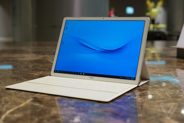
Huawei Matebook - this looks promising


CES was full of new 2 in 1, 12" Windows tablets. Sadly, the budget-friendly Toshiba Dynabook makes way too many compromises to hit its low price while staying super thin and light.

Now it's Mobile World Congress time, and surprise! More 12" 2 in 1s. Huawei is more known for phones and the tablet looks like an overgrown phone in a good way. It's very thin and light with nice rounded edges, and it's the same thickness as an iPhone 6.

There are some questions as to what the pen technology is (Wacom AES? Synaptic?), but there's definitely an active pen available as an accessory. Oh, and the pen has a laser pointer. That should keep your conductor cat on his toes.

Even the lowest configuration comes with an Intel core m3, vs the atom in the DynaPad, so hopefully, performance will be more than adequate.

For more information and some amazing photos from hands on time at MWC, check out the Verge article.
Tuesday, February 23, 2016

HP Pro Slate 12 vs Samsung Galaxy note pro at the Pops


Okay, okay, last size comparison for a while. But one of the other violists at the pops was reading from a Samsung note pro (left), so I grabbed a photo. She's also using MobileSheets. The screen is actually taller than it looks in the photo (same height as the PS12, just narrower), but with the music fit to width on a 16:10 screen the bottom of the display is empty space. It means she has room to keep the toolbars open during rehearsal without it pushing the music out of the way. She's very happy with the setup.

Thursday, February 18, 2016

HP Pro Slate 12 vs iPad Pro at the Pops


Our bass player uses an iPad Pro, so I grabbed my HP Pro Slate 12 (half a dozen blog posts later and I am getting so tired of typing that, so it's going to be the PS12 going forward) and took it back at the break for a photo op.

Yes, the iPad screen is that much brighter. I like keeping things a little less bright on our not so bright stage anyway, but even with the brightness up, the PS12 screen is yellower and not as strong as the iPad. And, either the iPad Pro backlight is that uneven, or it's a poor scan, but since none of my pages look like that, I'd be concerned about the backlight on that iPad.

I also take advantage of the highlighter tool to light up my repeats. The crazy extra markings around repeats are photocopied/scanned in.

The tablets are relatively close to the same size. The PS12 loses some screen space to the android nav bar at the bottom and it's a slightly smaller screen anyway. But the way MobileSheets auto-crops makes up for it and my music ends up displaying a bit bigger.

Using MobileSheets also made reminded me of how awesome half page turns are. I don't like having to enter edit mode, and a I really dislike the way the erase tool works, but grabbing bowings as needed (and highlighting up some repeats) didn't interfere with playing. I mark bowing changes in blue ink, making it really easy for the next stand to see what was changed.

Either way you go, this whole 12" 4:3 screen size is fantastic and I hope it starts showing up in more and more tablets.

Tuesday, February 16, 2016

MobileSheets on the HP Pro Slate 12

After many years reading my sheet music off an iPad, I had gotten pretty comfortable in Forscore. There is nothing like it in the Windows store and only one app that comes close in the Google Play store for Android. Yes, there are several other apps designed for sheet music, but only one with proper annotation tools - MobileSheets.

In the interim, I used Xodo docs on the Surface Pro 3, and luckily that app is cross platform. I can use Xodo on the Pro Slate and it functions more or less the same as it does on the Surface. This makes for an easy transition and a nice back up plan. The biggest pro - pick up the pen and write. 

But I wanted to give MobileSheets a proper look. I've messed with it on various devices here and there, trying to keep tabs on things, but I've never been able to really follow through with it. But I'm using it tonight, so I can finally get an idea of how it works beyond the surface level poking around I've done so far.

Why am I willing to dive into unfamiliar software like this at a rehearsal? Two reasons mainly:
1. I have Xodo as a backup. I've performed from Xodo on the Surface before and can switch over at any point to something I know how to make work. Also, it's rehearsal. There will be paper binders if there's a catastrophic failure and I really need something to fall back on.
2. I've managed a few practice sessions with it, so I have a basic handle on the two things that matter - navigation and annotation.

I'm bummed that annotation requires entering a specific mode. I've got it set up for a two finger tap and for better or worse, MobileSheets has a pretty cluttered interface, which at least than means edit mode is only a single tap away. It comes up quickly enough (much more quickly than my aging 3rd gen iPad could enter edit mode in Forscore), so I think it'll be enough.

Why am I trying MobileSheets when I know Xodo works? MobileSheets is an app with a dedicated music reading focus, so unlike a general PDF reader, it supports setlists and other organizational tools that will prove very helpful when it comes time to turn an alphabetical binder into a show order set. It also has tools like a metronome and media playback.

But the best thing about MobileSheets? It can crop PDFs on import. And it does a pretty decent job of it. I adjusted a few of the crops, but in general, you can let it do its thing and have a file that's an even better fit for your screen that just opening it in a PDF reader. Unfortunately, that's the only PDF manipulation it handles well. I used Xodo to create a version with all the blank pages removed as MobileSheets has a quirky work around to the fact that it can't delete pages that I'm not a fan of.

I've paired my AirTurn and verified that it'll turn in both Xodo and MobileSheets.

I'm not worried about file organization too much right now because I can chop up the part and reorder the turns later with annotations intact.

So, I'll give it a go tonight. I'll be reading on the HP Pro Slate 12 using MobileSheets and my AirTurn BT-105. 

Monday, February 15, 2016

HP Pro Slate 12 vs Surface Pro 3 vs iPad in pictures

I was just about to post about how I've been practicing with the HP Pro Slate 12 and I realized that, while I've posted comparisons to the size of paper music, I haven't posted comparisons to the other devices I've used to read music so you can see how much of a size upgrade this screen represents.


Left to right: iPad (3rd gen), Surface Pro 3, HP Pro Slate 12


Top to bottom: iPad (3rd gen), Surface Pro 3, HP Pro Slate 12


The Qualcomm pen (top) comes with a cap and has an interesting grid, which I assume is speakers for the ultrasonic stuff. It's a little weird for holding, but it's nothing that can't be gotten used to. My poor surface pen (bottom) lost its clip when the toddler tried to pick the surface up by the pen while the pen was slotted into the case.


Left to right again: iPad (3rd gen), Surface Pro 3, HP Pro Slate 12

The VSM edition of the Bach solo cello suites for viola on all three, open in Forscore on the iPad and Xodo docs on both the Surface and the HP Slate. I have no idea why the color is so different other than that's just how the screens are. The warmer tone of the HP Slate should be nice on stage, I guess. I'll find out tomorrow when I use it at a Pops rehearsal.

The iPad seems so small. It's hard to believe I put up with that for years. I'm so glad bigger screen slates with good aspect ratios are becoming more of a thing now. 

Sunday, February 14, 2016

Update on the Toshiba DynaPad - Nevermind

The reviews are coming out, and it's not looking good. Apparently, this tablet has speakers that are so atrocious, reviewers are actually commenting on the speakers, which are normally not even discussed on pen tablet that would primarily be used for drawing/writing/notetaking/not listening to things. Additionally, the Atom processor paired with eMMC storage is disappointing.

This review from AMDtechreviews sums it all up pretty well: