Friday, November 11, 2011

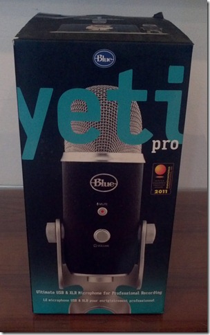
Blue Yeti Pro Review

IMG_0191

I've been using a Blue Yeti USB microphone for recording at home and at the studio since its release last year.  At CES this year, I had a chance to see the next generation of that microphone - the Yeti Pro.  Now, I've had the opportunity to spend to some quality time with one to see how it compares.  Let's just get to the meat up it up front - it's amazing.  

Back when I got a Yeti for myself, my husband was disappointed to see only a USB connection.  That meant he couldn't "borrow" it for his projects too.  Blue fixed that by adding XLR output to the Yeti Pro.  The other main upgrade is the 24 bit audio signal and some other numbers that didn't mean much to me when I saw it at their booth at CES.  At the time, I was more interested in the flexibility of choosing between USB for recording directly into a computer, and XLR for going through a larger audio interface and adding the Yeti Pro into a mix of other mics.  The Yeti Pro has the same triple capsule set up as the Yeti allowing for 4 different patterns - omni, cardioid, stereo, and front/back.  

For my usage though, it turned out the be the 24 bit sound processing that made the most difference.  My main recording scenarios are all tied directly to a computer.  I'm usually just recording one track, either a single instrument or an ensemble with a single mic in the middle.  The samples of my trio were all done with the Yeti in the middle of group on omni with some reverb added later in GarageBand.  For the most part, the Yeti lives on my desk, ready to go for single instrument recording of my own practicing, both solo and with Smartmusic accompaniment.  

First a quick word on the hardware.  Just like the original Yeti, the Yeti Pro is big and heavy.  Rather than the smooth silver finish of the Yeti, the Pro is wrapped in a grippy black textured material.  It feels about the same weight wise, but I find the textured finish on the Yeti Pro to be more, well, professional feeling.  The wiggly volume knob of the Yeti is no longer a problem on the Pro, and the whole thing feels sturdier in general.   

A lot of handling noise came through on the XLR connection, so Blue also makes a shock mount specific to the Yeti and Yeti Pro.  It's incredibly sturdy and very high quality.  It's also massive.  Unlike the cylinder style mounts I've seen in the past, the Yeti shock mount is a ring inside a larger ring and connects to the base of Yeti, leaving the whole thing looking pretty unbalanced, but it gets the job done.  Luckily, my desk doesn't produce a lot of vibrations, so I didn't really need the mount most of the time.  If you are in an area where vibrations are an issue, or you'll be moving the mic often, the shock mount is a great addition.  

IMG_0193-1

The vast majority of what I do at home is recording for my own practice purposes.  Nothing beats listening back to a recording of yourself to get an idea of how you're really sounding.  The more realistic the sound coming back, the more helpful the recording is.  In this case, the Yeti Pro makes a world of difference.  24 bit was just a number to me until I turned it on.  

Which brings me to a little aside about the software.  The Yeti installed its drivers automatically through Windows.  The Yeti Pro required downloaded them from Blue's website.  Windows was still set to record in 16 bit, and I had to dig through the advanced setting to turn it up to 24 bit and take full advantage of the Yeti Pro's increased sound resolution.  

Creating recordings with Smartmusic as accompaniment was easy and the results sounded great.  Unfortunately, the Smatmusic license doesn't allow for those recordings to be posted, but I was impressed with the Yeti Pro's performance.  I was able to set it at the edge of my desk, in front of the speakers, and with the pattern set to cardioid, I had no problems with bleed through from the speakers.  A mid level gain was all I needed to get good balance.  

multi mics

Recording straight into Audacity via the USB cable was just as straightforward.  Audacity will give you dual channels if you have the mic set to stereo, or a mono track if you're using a cardioid or omni pattern.  I wanted just the sound of the instrument, and not the whole room (or the buses that go by outside), so I sat close and had the mic set to cardioid.  

My final testing was done via the XLR connection going through an Apoggee duet into Garage Band.  For that test, the gain on the Yeti Pro was set all the way down, and gain adjusted through the duet.  I had no problem getting a strong clear signal.  The sound through the XLR connection is a little cleaner and smoother to my ears than through USB.  

The 24 bit recording certainly makes the biggest difference though.  I liked the sound of my Yeti, until I heard the Yeti Pro.  Now the Yeti sounds harsh and brittle.  The extra bits bring through way more of the detail in overtones that a bowed string instrument (viola in my case) produces.  The sound was much richer, warmer, and smoother than the Yeti.  It's a much better base of sound to work with.  Of course, most of this can be covered up in post production with various effects and such, but it would take much less work to turn the Yeti Pro's signal into something I'd throw up on the web or on a demo CD.  

(Posting these recording is just not in the cards right now.  Crazy things have been afoot the past few months, and processing and posting the test tracks just didn’t make the list of things that happened.  I know sound samples are the best way to judge a new mic, and I hope to be able to get those up sometime in the future.)

If you already have a system to take advantage of the XLR port, I would recommend that set up for the best sound. But the great thing about the Yeti Pro is that it also has the USB port, so you can toss it in the bag with your laptop and get a great sound in a mobile package.  For casual home, desktop, or even small ensemble recording of acoustic instruments, the Yeti Pro is a fantastic choice. 

Saturday, November 5, 2011

Ink in OneNote Web App, Still Not Useful

onenote web ink

When I said I needed OneNote’s web app to have viewable ink, this isn’t exactly what I meant.  I like using OneNote to keep notes in the studio, but I dislike only being able to view those notes on Windows in OneNote.  Office has a good online web app version of Office, which includes access to OneNote notebooks, but ink would always just show up as [unknown objet]. 

When I logged in today, I noticed that you can now see the ink.  Gee, thanks Microsoft.  I can totally read that.  *sigh*  Evernote is looking better and better. 

For reference, this is the same note in OneNote (the full program) running on Windows:

onenote program ink

Saturday, October 15, 2011

Initial Impressions–the Yeti Pro is a Worthy Upgrade

2011-10-10_21-28-20_946
I’ve been running some test recordings with the Yeti Pro side by side with the original Yeti, and a small capsule condenser mic.  Both Yetis are currently recording via USB into Audacity on two separate Windows machines.  The condenser mic is going into Logic Pro on a Mac Pro through an Apogee Ensemble.  I’m still working on finding the best way to post the comparisons in a way that you’ll still be able to hear the differences on the other side of the internet, but for now, here’s what I’m hearing…

Tuesday, September 27, 2011

Blue Yeti Pro in the House


2011-09-27_13-42-42_338

The kind folks at Blue have lent me Yeti Pro to test drive, and I can’t wait to see what this thing can do.  With dual outputs (USB and XLR) this mic should be equally at home in the teaching studio plugged directly into the tablet via USB, and in the rehearsal studio plugged into the big audio rig via XLR. 

Thursday, September 22, 2011

Blue Microphones Announces the Yeti Pro–USB and XLR!

YetiPro_Mac_Laptop_Ringer

I’ve been using the original Yeti in the studio and at home since it came out.  My husband recently “borrowed” it for recording at his band’s rehearsal studio.  I hope it makes it home again some day, but it might get to stay there now that Blue has announced the new Yeti Pro. 

YetiPro_ThreeQtr_Y-CableI did get to see the Yeti Pro at CES, but I didn’t get information on when it might be released, but now it’s official.  Our only complaint with the original Yeti was that it was USB only.  While that’s okay for me, since I mostly work from a computer, my husband has a full set-up and would prefer an XLR connection. 

Enter the Yeti Pro – dual outputs, USB and XLR!  It looks just like the original Yeti, but in black.  It has the same triple array custom condenser capsules that can record in cardioid, omni, stereo, and bi-directional.  It records at 24bit/192kHz, the highest digital resolution on the market. 

The Yeti Pro is available now from authorized Blue Microphone dealers with an MSRP of $249.  See the full press release after the break.

Saturday, September 10, 2011

The Gigging iPad Caught on Camera

As promised, I remembered to take a picture this time. I was also able to start a draft of this post during the ceremony thanks to a new tool/toy,but more on that later.  It turned out to be the shortest ceremony ever, so I only got one sentence done before the pronouncement. The only thing after that is presenting the new couple, then it's recessional time.

A side note - we set up in the back so no one could see me thumb typing away, and I was still the first member of our group to notice we needed to be ready to play. The ceremony is always priority. I try to be really careful to make sure my toys don't become a distraction.

So that new toy? It's really just an upgrade on a current one. I picked up an HTC EVO view.  It's basically the exact same thing as my Flyer, but with a 4G radio from Sprint.  I was tethering from my phone when I wanted to be online, but that's a hack so I try to avoid doing it too much. It's great to have always on internet on the tablet.  In fact, that's how I'm posting this, well out of WiFi range, from the Blogger app on the View. I also took this picture with the View, making it easy to add to the blog post. I'm getting pretty good at thumb typing.

It's making me think I should pick up a 3G iPad for gigging whenever the next version comes out, but there's something to be said for separating tasks. I wouldn't want a notification popping up while I'm playing. Then again, I could just turn that off while I'm playing. Hmmm....


Saturday, September 3, 2011

Digital Trio Gigging: An iPad, ForScore, and the Footime Pedal


I keep forgetting to take pictures of the iPad in action, but you all know what an iPad looks like.  My recent digitizing efforts have paid off as I've now played several weddings from the iPad.  

Before I get into the successful weddings I've played with an iPad in front of me, I should also mention that I've run into my first real bit of resistance to digital music.  I've had open minded stand partners that were willing to work with me and try out the digital scores.  I think that was made easier by the ease of using an active pen with windows; there was no learning curve to putting notes in the music.  But last weekend, I had a conductor tell me that he would not allow me to read from the iPad.  There was no good reason other than he was not comfortable with it.  Last I checked, he didn't have to read my music, but whatever, I had my paper parts as back up (which required windclips and a stand light, neither of which the iPad would have needed).  After the conductor told me I could not use my iPad, he also noticed the bassist was using one as well and tried to tell him it was not allowed.  After explaining that he would have gladly made a book had the conductor said something after the previous rehearsal (that I had to miss) where he had also been working from his iPad, he got to keep his. 

But back to happier stories.  I just got back from yet another wedding gig with my trio, playing from the iPad, and I will never go back to the paper books.  There are several reasons:

  1. Only one thing to carry.  I guess it's actually two things, since I have the foot pedal also, but it sure beats a dozen gig books and miscellaneous photocopies.
  2. Hands free page turning.  I've been known to put paper on the stand (for things I haven't scanned yet) and stomp on my foot pedal, wondering why it won't turn.  Seriously, it's so easy to turn by foot pedal.  And not having to put the instrument down and bend forward to turn the page is a huge back saver.
  3. It's cool, which means memorable.  I know, it's like drinking the Kool-Aid, but guests come up to me after the wedding to ask about it, which means they'll remember us, and hopefully book us again for the baby shower. 
  4. The time is in my face.  We are booked by the hour.  We used to always be checking our cell phones in between songs to see how much time we had left.  Now I'm looking at the time whenever I'm looking at the music.

But I'm such a huge advocate for windows based tablets with active digitizers, why am I using an iPad?  Also, several reasons:

  1. Battery life.  Most gigs are only booked for 2 hours, which would easily be covered by any of my machines, but it's nice to have battery life to spare and not ever have to worry about it. 
  1. Single purpose software for a single purpose application.  When you're playing a gig and all you need to do is read the music, you don't need a full blown desktop OS running in the background.  Sometimes you don't want to multitask.  Although, I should admit that I've managed to crash ForScore on occasion.
  2. Lightweight.  It's the lightest weight thing I have that's big enough for music reading.  Yes, that 1lb does matter.
  3. Touch navigation.  It really is way nicer than having to pick up the pen to select the next piece.  I'll be keeping an eye on the dual digitizer pen and touch windows tablets, but nothing out right now fits the bill.  The Asus EP121 lacks the battery life, and even the new Samsung tablet at 11.6" widescreen will still likely be too narrow in portrait mode.   
  4. The gig books are already small.  One of the main reasons I turn to my Lenovo x61t for orchestral music is that orchestra music is printed on bigger paper.  Shrinking that down to iPad size makes it very difficult to read.  12" is also much easier when you need to share a stand.  With careful cropping, the gig books, which are already only 8.5"x11" do just fine on the iPad's smaller screen when I don't have to share it. 
  5. Half page turns.  I need to look into a program that will do this on Windows, but I have to say, I am getting spoiled by ForScore's half page turns.  It's very convenient to flip to the top half of the new page while still looking at the bottom of the old page.  It means there's never a time when the next thing I need to play isn't already showing on the screen
  6. No markings.  It's gig music.  I don't really need to mark it as much.  I'm also getting more used to ForScore's system of stamps for easy and clean markings when I do need them.  I wouldn't ask a stand partner to learn to use stamps, but they're good once you've gotten used to them.
  7. People already know what an iPad is.  It may be petty, but it's true.  There are times I just tell people I play the violin when I don't feel like explaining what a viola is, again.  Sometimes it's just easier to say "yes, I'm reading from an iPad" rather than explaining that it's actually a something different.

All in all, I'm really enjoying the iPad for use with my trio.  Our violinist is also seriously considering the setup as well.  He has an iPad and is looking into getting a foot pedal.  Our cellist has declared the iPad way too small for her, and wouldn't be comfortable having to read from it.  We are always in shade for outdoor gigs (contractually as direct sun would be bad for the instruments) but I have run into some glare issues.  It's only been annoying reflections though, nothing unreadable with the brightness all the way up.  I'm considering a matte screen protector, but I have a hard enough time getting those right on a phone.  We have too many cats for me to get 10" of screen protector down without getting a cat hair stuck under it. 

So that's what I've been up to, and will be up to for the next several weekends.  I'll try to grab some pictures next time.  

Saturday, August 20, 2011

Creating PDF Sheet Music v2

With the new release of ForScore for the iPad, I've been re-inspired to work on scanning more of my music.  After all the linux fun that was had at the Partimus install day I've also been inspired to work in Linux more.  So I've been playing with some new tools to turn my music into PDFs.  

In windows, I still use Windows Fax and Scan to do the initial scanning.  The included Document preset is good.  I like to scan at 300 dpi.  Going down to 150 dpi results in jagged staff lines, which I find distracting.  Fax and Scan also has an easy cropping tool.  Since I’m preparing these gig books for reading on the iPad, trimming out the extra dead space is essential to maximizing the size of the actual music.

cropped scan

From there, if I were creating a Journal file to use on just the Windows tablet, I would paste the scanned images in page by page.  This has worked fine for shorter piece, but this time, I wanted to scan serveral 40 page gig books for just reading as PDFs on the iPad.  Finding a program that will turn the scanned images into a PDF should be an easy google search, but most of what comes up are trialware programs that will leave a watermark during the trial and then cost $30 or more to buy.  The thing is, I haven't found one that's worth it.  They've all been clunky or buggy during the trial and I've not found one that I've wanted to keep using.

Until I stumbled upon a little free utility.  The download is just  a zip containing the exe, you don't even have to install it - just as it should be; a simple program for a simple task.  The utility imports the scanned images by folder.  A little rearranging later and you're ready to export the PDF.  I've found that this one even generates the PDF much faster than the trialware options, and even exported some larger ones that the trialware errored out on.  

jpg to pdf tool

From there, the PDF goes into Dropbox to be made available to any machine I would want to read it from.  Conversion to a Windows Journal file is as easy as using the Journal Note printer from any PDF reader.  (Journal installs a virtual printer that can be accessed from any program).  This will still get me to a Journal Note faster than pasting each image into a page.  With the PDF in Dropbox, I can also open it from ForScore or UnrealBook on the iPad.  

Another great scanning tool was put into use this weekend when an orchestra sent practice parts as copies on loose paper.  That presented the perfect opportunity to test the NeatDesk autofeed and PDF creation tool.  The NeatDesk can feed through up to 50 loose sheets front and back and turn them into a PDF.  It's great to set all the pages in the NeatDesk, press the PDF button and let it do its thing.  The only problem that came up was that it decided that page 4 (of nearly 30) should be landscape.  All of the other pages came out oriented correctly, but page 4 would need to be rotated.  I just use the free Foxit reader in Windows, and that will only rotate the entire file, not a single page.

A google search for PDF tools turned up the same mess of trialware that may or may not actually do that one simple thing I needed - rotate just one page and leave the rest the way they were.  

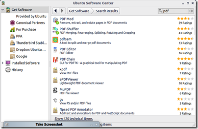
This is where I go to Ubuntu.  I had also been playing with scanning options there.  A search for PDF in the Ubuntu software center yeilds lots of helpful tools, all free and open source.  In addition to the already installed scanning program, I found a JPG to PDF conversion utility, a scan to PDF program, and two tools that allow you to rotate, rearrange, add, and delete pages within a PDF.  Both tools were fast, simple, easy to figure out, and did exactly what I needed with zero hassle - allow me to rotate one page while leaving the rest alone.  After the mess of results google gives for windows software, it was refreshing to search for "PDF" and get these two great utilities as the top two results in the Ubuntu software center.

Screenshot-Ubuntu Software Center

Screenshot-PDF-Shuffler

Xournal does an equally good job in linux of importing and annotating PDF's.  The only drawback vs Journal in Windows is that I don't yet have it set up to see the eraser end of the pen as the erase, so you have to select the eraser tool from the menu bar rather than just flipping the pen over.  I have not yet tested it with the foot pedal, but as it just sends page up or page down, I'm sure it will work fine.

Ubuntu actually runs faster and lighter on my hardware (Lenovo x61t), and would make a good option for both scanning and reading music.  The other two drawbacks I've run into are that Neat does not provide linux drivers for their scanners and there are no open source ones available, so I'd have to manually swap pages on the flatbed scanner, and that battery life is a little less under Ubuntu than when running Windows.  

But now I have several options for turning my paper music into PDFs using free tools.

Monday, August 8, 2011

Partimus Install Day - Setting Up Ubuntu Machines for an SF School

 
It's fun to talk about the latest and greatest tablets and debate the merits of various hardware for educational uses, but this weekend, I got a good look at the reality of technology in the classroom.  I read about all these initiatives to get computers in the hands of the students, and I think they're great, if your school can afford it.  Students should have as much exposure to computers as possible, as they are a reality at about any type of job out there, and will only be more ubiquitous in the working world as these kids get closer to graduation.

This past weekend, I had the privilege of helping a school that can't afford any amount of classroom computers, beyond the lab they got a grant for, get set up with some classroom computers.  KIPP Bay Area is a middle school level charter school in the San Francisco public school system.  This is one of the top charter schools - one that parents hope to get their kids into.  And they had no computers outside of the grant funded lab.  Partimus, a non-profit organization that provides repurposed computers running free and open source software to students and schools which need them, has donated dozens of machines to get these classrooms (and those at several other area schools) into the digital age.

The video station installs in progress.
Our task for the day was to set up machines in 3 different classrooms.  A social studies teacher got six machines so her students could go online to do research.  A math teacher got 6 machines so his students could do online math programs.  The final classroom was set up with two of Partimus's better boxes to do video editing.  And all of this at no charge to the school.  The hardware is donated and the software is free.  We spent the day getting piecing together working sets of towers, monitors, power cables, mice, keyboards, hubs, switches, and ethernet cable, and then installing and updating Ubuntu 10.04.3.   This is the long-term support version and will be current until the next LTS release comes out in April of 2012.

Many of the machines were already running older versions of Ubuntu, or Xubuntu, and I think we did encounted one that still had windows of some vintage on it.  In 14 machines, we only encountered one bad hard drive.  It's amazing what older hardware is still capable of, especially with the lighter running Ubuntu.

Just as we were cleaning up and heading out of the social studies room, the teacher arrived to do some set up and she was so happy to have internet access for her students to be able to do research.  It didn't matter what kind of computers she got, or what OS they were running, she was just so grateful that her students would have access to the whole internet's worth of information.

It was great to get to be a part of something like that. 

Sunday, July 31, 2011

Where are the Android Tablet Music Readers?

News of latest release of forScore for the iPad has gotten me interested in working with the new generation media slates again.  With wedding season heating up, I’ve been scanning and moving my trio music to dropbox in the hopes of ditching that gig bag of books too (as I’ve already ditched most of my teaching bag). 

The thing is, I’m not a fan of the iPad.  I’m not saying it’s a bad product or anything, just that it’s not my thing; personal preference. It’s still a little small for what I like in a music reader, and lacks active pen input, but I think it could work for our trio music. Most of our books are made from smaller letter sized paper, rather than larger sheet music (A4, I think).  With some cropping of the scans, this music comes out an acceptable size for the iPad display.  The trio music doesn’t require much in the way of markup, and in my limited use I’ve found the drawing tools in forScore to be much improved.

I’d love to give an Android tablet a try, as I already use an Android smartphone and I love my HTC Flyer, which at 7” is way too small to consider for music reading.  I’m not alone, as I’ve gotten a few emails from readers interested in Android tablets for sheet music.  So I went looking.  There are few enough apps in the Android market that are specifically for tablets anyway, and none of them are PDF music readers. 

So, I emailed forScore to see if they might have any plans to break into the Android world and their reply echoed a lot of what I’ve been hearing from other app developers.  I do appreciate the time they took to explain.  Here is their response:

“First off, the biggest reason why we haven't jumped into the Android ring is simply a matter of resources: we started and continue to run our company during what will probably be considered the worst economic conditions of a generation, so we've always been very deliberate in how we spend our time and resources. We'd rather make a single product that's really solid and gets frequent updates than two products that don't always work well (the latter being the approach that all too many developers take).

Secondly, the iPad commands an overwhelming majority of market share at this point. We'd be spending more than half of our time working on a version that may only yield a small percentage of the sales we see with the App Store, so it's just not worth it at this point.

Finally, and really most importantly, the Android environment itself just isn't as attractive. From a hardware standpoint, there are a bunch of different devices all with varying capabilities (some have cameras, some don't, some are very fast, others can barely keep up). If we have to either ship an untested product or purchase one of every Android tablet out there, then that's a big issue to take into account. From a software standpoint, Apple's environment is just a lot more attractive and easier to work with on the whole. There's a level of integration that Google can't match, and the ubiquity of the platform makes it easier to get help from the community as needed.”

I can’t blame them.  It’s one of those catch 22 cycles where there’s not enough adoption of the platform to warrant developing apps for it, but no one is going to adopt the platform if there aren’t enough apps.  No one want to write for a platform that people aren’t using, and people don’t want to use a platform that no one is writing for. 

Also, while the hardware has become much more standardized on honeycomb (10” 1280x800 screens, Tegra2) there are still plenty of variations even in those (camera? SD card? microSD? full size USB?).

The real killer though is the screen.  The 10” widescreen is simply too narrow in portrait mode.  I swung by Best Buy to check them out again, and was able load a PDF of music from my dropbox.  While there are no specific music readers, there are plenty of tools to read PDF files.  The iPad is barely passable in size for me, so the narrower Android tablets were just too small.  With their smaller screens and lack of apps, I could not recommend an Android tablet for music reading.  Not on the current generation of hardware at least. 

Thursday, July 21, 2011

SmartMusic Inbox: SmartMusic Goes Mobile

SmartMusic Inbox

Looked what showed up in my feed this morning.  As reported by choirguy at techinmusiced, SmartMusic now has a mobile app.  It’s something educators have been calling for in the forums for a while now – a mobile app to sort through the inbox from your smartphone.  It’s available as an app for both iPhone and Android phones. 

If you are using the educator version of SmartMusic, and you have students sending assignments into your inbox, it’s a great tool for going through them. You can view classes by student or assignment, listen to recording made by the students, grade and comment, add or edit points, and email from the app.

I installed and got as far as being told that my account is not set up for mobile access.  I wasn’t terribly surprised, as I don’t actually have an educator subscription.  This app only provides access to your grading inbox, and you only have one of those if you have an educator account. 

I’ve been reminded by SmartMusic that I should have an educator account since I’m a teacher, but I still just have a student account.  Why?  Because the educator account offers very little value add for me as a private Suzuki teacher.  Suzuki music is not assessable, so I couldn’t create assignments around my core teaching material.  Sure, I could assign supplemental work, but none of the supplemental music I use in my studio is available in SmartMusic either, and yes, I’ve submitted the requests.  I really just use it to play the accompaniments to the Suzuki repertoire in the studio, and occasionally for some sight-reading practice. 
I keep meaning to look more closely at the educator version and create a plan for actually implementing it in my studio, but I just haven’t had the time.  Private Suzuki teachers using the educator tools, feel free to leave a comment with ideas.  

Monday, July 11, 2011

A Wedding and a Kindle

IMG_0102

For all the weddings I've played in the Bay Area of San Francisco, and more specifically, in Silicon Valley, it wasn't until a recent family wedding in Ohio that I ran into an officiant reading the ceremony rites from a Kindle.  We've worked with a wedding coordinator who was using an iPad to keep track of things during the ceremony, but the officiants have always been working from either a book of rites, or a leather binder with loose papers. 

I had a chance to speak with the Pastor after the reception for a bit.  The Kindle is replacing a massive bible with tons of paper stuffed into it.  He said he's tried a nook before also, but found the Kindle's highlighting and annotation features to be superior.  The nook wouldn't let him export notes out of the book; he had to open the book to see the notes.  His current workflow in a book is to highlight and take notes, then export those notes into Everntote for reference.  He also currently uses Calibre to convert PDF files into a format that can be directly brought into the Kindle. 

IMG_0082

Interestingly, he still uses a paper outline for sermons.  He said he can get talking off one point and find that when he comes back to his notes, he's three pages ahead.  In these cases, the quick flipping of the paper notes works better than having to click through eInk refreshes on the smaller screen of the Kindle. 

I should also mention that this was a very bright sunny summer evening and he was standing in full sunlight during the ceremony.  The eInk screen was essential in this context.  I don't know any backlit screen that could have kept up with full on direct sunlight. 

Another bonus with the new 3rd generation Kindle, is that it is super light and easy to hold in one hand while performing the ceremony, and the slate grey blends into the formal setting nicely.  Even with the nice leather case (with a built in book light) the Kindle is small and light. 

Even better, this Pastor blogs, is on Facebook and twitter, and his business card has a QR code on the back.  He also hooked me up with a Google+ invite.  +10 internets to Ohio. 

IMG_0128

Sunday, July 3, 2011

A Detour into Smartphone Land

IMG_0027

I like tablets, so why is a smartphone leading off this post?  Well, this is what I’ve been up to recently.  Enjoy the ride…

Sunday, June 19, 2011

HTC Flyer Does the Media Booth


A few weekends ago, I had the opportunity to put the Flyer to the test in the media booth. Our church runs backgrounds, lyrics, sermon slides, and other media from a tower in the booth running Pro Presenter 4. I sit right next to the video producer and was also on iris duty during a short drama vignette.

The service agenda comes in Word format and was emailed to me, but is also available online. Our church uses Planning Center for organizing people for each weekend service. Planning Center has an Android app that would allow me to download all the files associated with a particular service. Either way, the Word document is handled by Polaris Office on the Flyer, which supports the pen. So I was able to ink my notes right over the agenda.

The 7” screen is not quite as nice to work with as the 10” screen on the TC1100 I normally use for this purpose. I did feel cramped on occasion, but the capacitive multitouch screen made zooming easy. The other nice thing about working with the Flyer in this context, is that you can only ink with the pen, so it never mistook my fingers when zooming or panning as ink.

It’s definitely a portable option for annotating Word documents, and the battery goes all day, so I never had to worry about it. I was able to switch over to the notes app during one of the services to take notes for myself. I’m calling it a success.

Saturday, June 11, 2011

An iPad with ForScore at the Pops

IMG_20110607_185145

The digital sheet music is catching on!  At rehearsal this past Tuesday, one of the bass players unpacked an iPad and a wireless page turn pedal.  I think it’s a PageFlip, but I didn’t look closely enough to see for sure.  I wasn’t expecting so much excitement, so I only had my phone camera to take pictures.  I watched him turn a few pages, and didn’t notice any lag coming from the fact that it’s running over bluetooth rather than wired. I’ve just fought with so many bluetooth pairing issues with other devices that I’m not sure I’m ready to trust it, but I feel bad about the wire that hangs down from my set up now.

IMG_20110607_185206

He was using ForScore for the music, which was neat to see, as I use UnrealBook on the iPad.  Annotation in ForScore is quite impressive.  You can draw by hand (or capacitive pen, like you see on the stand), or insert stamps from a variety of pre-set symbols.  He had done the fingerings and accidental reminders all from stamps rather than handwriting them in. 

IMG_20110607_185302

It still seems more cumbersome and less natural than just writing things in during rehearsal, but all of the stamped stuff was inserted during his practice time at home and was all ready to go by rehearsal.  While my preference would still be an active digitizer for really accurate handwritten annotation, I can see how the stamps are a great solution for a device that doesn’t have an active digitizer available.  They come out clear and easy to read and live in a dedicated space above the staff. 

IMG_20110607_185151

The violist who shared a stand with me while I tested the LE1600 (12” 4:3 screen) was also checking out the set up and she commented on how small it was.  He jokingly said “it’s only a bass part” and then pointed out that with the brightness up high enough, the display was clear enough to be readable. 

This reminds me that I need to prepare for the concert tomorrow.  I read off paper *gasp* for the first time in a while at the dress rehearsal, as I didn’t get time to prepare the digital score ahead of time.  I have the PDF, and I did send it to a Journal note, but there were too many extra blank pages, and I just didn’t have the time to clean it up before leaving for the rehearsal. (Yes this means I only skimmed the music ahead of time as a PDF and didn’t really practice it before the rehearsal.  This set is mostly pieces we’ve played before.  There were only a few new pieces and they were quite sight-readable.)  I managed to make all my page turns, but it wasn’t nearly as nice as tapping a footpedal.  Also, my spot on the stage is dim and I’d rather work with light-up music than deal with a stand light. 

Thursday, June 9, 2011

Using “paper” for note-taking

Disclaimer: I realize I am not the first person to do this, but since it came out of a real conversation at work, I just had to.

IMG_0625

So, yesterday, at the end of the day, the boss’s kid and some of his friends were wandering around the office.  Drawn in by the lure of intern M&Ms, they came over to chat.  Boys at that age can be so fun to chat with.  One of them asked about my tablet, the HTC Flyer.  I showed them the notes app and a webpage I had been working on marking up.  When the boss came to collect them, he mentioned a new development in portable note-taking called “paper.”  I’m all for trying new things, so I decided to give it a go.

Conveniently, there was a neat, super small form factor version of the paper called stickies on a nearby desk.  I pulled the pad of stickes over to try it out.  Sadly, it didn’t respond to my Flyer pen, which was the only one I had on me at the time, so I had to wait until I could find the right stylus.

My husband sometimes works with paper, so we have some at home for me to try out.  I also have access to several types of pens and styluses at home, so I was pretty confident that I could find one that was compatible with paper.

It was a bit more challenging than I thought to find the right one.  If you’ve seen my inking comparisons video, you can see just how confusing the current state of pens and incompatibility can be.  None of my Wacom pens worked, so I can safely conclude that paper is not Penabled.  The capacitive pen I use with the iPad was a no-go also.  I finally ran into some luck with my 3-in-1 stylus.  The plastic tip that I use with resistive screens didn’t work, but both the “pen” tip and the “pencil” tip worked!  Although you do have to be careful which one you choose before you start, as the pen tip does not have erase functionality like the pencil tip does.

Once I found a working stylus, I was ready to get inking.  Here we get to the good part, the inking is smooth and palm rejection is pretty good.  Your hand won’t generate ink or vectoring, but it can interfere with ink that is already down, generating “smudging” if you’re not careful.  The texture of the paper feels nice under the tip.  The pen just works, but the pencil end occasionally requires pressing a button to get more lead to come out to continue writing.

One nice thing about the paper is that it doesn’t require any special programs or apps to do the note-taking, you just grab it and start writing.  Some other advantages include spectacular battery life.  The paper can last decades before the display starts to yellow a bit.  It’s very lightweight and available in a wide variety of sizes and form factors.  There is even a neat version with a little adhesive strip in the back so the smaller ones can be stuck to things.

However, I’m finding the paper to be missing several options I’m used to having.  There is no way to add space in the middle or move the ink around once it’s down.  While you can add images or documents to the paper, it requires a separate piece of hardware called a printer.  Also, once you’ve got the image or document down, you can’t move it.

Another thing that requires separate hardware is OCR or handwriting recognition or conversion to text.  You’ll have to scan the paper in to have a computer run the OCR with another program or app. 

Organization is also an issue with paper.  I’m used to having the folder system built in and being able to tag notes, but with the paper notes, you just have to keep track of where you put them.  If you want folders, you’ll have to get them separately.

Another thing I miss is the infinite page.  The paper doesn’t get bigger as you write, so when you fill a page, you have to go get another one.  Paper is frequently packaged in bundles or notebooks to help you keep extra pages handy.

So, paper clearly does have several advantages, but is it enough to get me to switch?  I’m afraid I just can’t give up my syncable, scrollable, searchable ink.  Also, I hear they have to cut down trees to make the paper.  I like trees.  I think paper is not for me.

Saturday, June 4, 2011

HTC Flyer full review

This is a repost of my review for TabletPCBuzz.com.

Introduction


In a market that’s now being flooded with 10” Honeycomb tablets, HTC is already being different with their 7” Gingerbread based Flyer. The real stand out feature of this tablet is the n-trig duo sense pen and touch digitizer. HTC is no stranger to working with Android, with their Sense interface adorning many Android based smartphones. This is Sense’s first appearance on a larger tablet, in addition to the first one to hit the market with an active digitizer. So, how does it work? Is it worth adding a pen to an Android tablet? Short answer – oh yes. Long answer – read on…..


Saturday, May 28, 2011

How to get the Footime Pedal working with Unrealbook on the iPad

The magic setting is in Network Settings > BT Keyboard Connected > ON.

IMG_0607

Make sure the button on the back of the pedal is pushed in.  Ignore the warning that “The connected USB device is not supported”.  It will disable the onscreen keyboard, which is a bit annoying, but it will turn your pages if you have the “BT Keyboard Connected” set to ON. 

Luckily, the iPad works just fine “upside down” once you get used to the home button being on top, since the camera connector sticks out.

Inking Shootout - A Comparison of Many Inkable Things

Here’s a repost of a video I made for tabletpcbuzz:

With the HTC Flyer in the house now, I have machines sporting two different active digitizer technologies and two different touch screen technologies in various combinations of form factor and operating system. Here's a video comparing the inking in the context of simple note-taking.


A summary of the devices:
HP TC1100 - Windows 7, OneNote 2010, Wacom Penabled
enTourage eDGe - Android 2.2, Custom Journal app, Wacom Penabled eInk screen, OneNote syncable via USB connection to computer
Archos 9 - Windows 7, OneNote 2010, resistive touchscreen
iPad - iOS 4.3, Penultimate, Targus capacitive stylus
HTC Flyer - Android 2.3, custom Notes app, n-trig duo sense pen and touch digitizer with battery pen (digital pencil, magic pen), Evernote syncable through the cloud

Monday, May 23, 2011

HTC Flyer ink is searchable in Evernote

ink search in evernote

I didn’t think it would be, as it’s sent over as a screen shot of the device.  A special request on the XDA forums inspired me to give it a try though, and low and behold, the handwriting is searchable! 

Pocket Notetaking Battle–HTC Flyer vs enTourage pocket eDGe

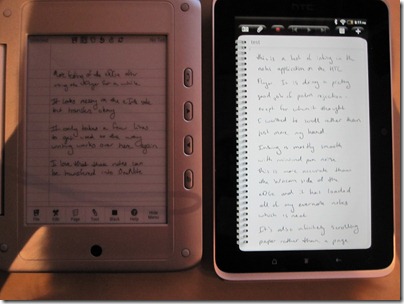
It’s tricky to get a side by side shot of these, as one is eInk and one is a backlit LCD (the rest of the eDGe is off to the right), but here you go….

IMG_0575

The HTC Flyer is a 7” Android tablet with n-trig’s Duo Sense pen and touch digitizer.  The eDGe is a 7” Android tablet attached to a 6” Wacom Penabled eInk screen.  Sony also makes some readers with Wacom Penabled screens, but they lag so much as to be unusable for notetaking. 

As far as 7” Android tablets go, the Flyer has the eDGe beat, no question.

Capacitive over resistive screens

1.5 GHz Snapdragon over 1.2 GHZ Marvell

1024x600 screen over 800x480

Gingerbread with a Honeycomb update over Froyo still in beta

Front and Rear cameras over just a Front camera

Way better multimedia support and full market access over the enTourage store that just went under

Despite all of that, the eDGe does have a few advantages.  The eInk side is Wacom Penabled, which many prefer over n-trig’s digitizer.  This particular implementation, over eInk, doesn’t seem any more accurate to me though.  But the fact that it’s pen only means palm rejection is a sure thing, and writing notes on eInk really gives you the feel and look of writing on paper, minus the lag of eInk.  The fact that the eInk is on a separate screen means you can also keep reference materials open on the tablet side while writing on the eInk side. The eDGe is also considerably cheaper if you can still find them (after a woot sale at $150, several have shown up on ebay from buy.com for $160, but they have been pulled from Amazon). 

My favorite feature of the eDGe is a third party app that runs on Windows and will import your eDGe journals into OneNote as ink.  That means the ink can be marked as handwriting, indexed, searched, and even converted to text.  I found the text conversion to be flawless despite the slightly messier than normal inking. 

The HTC Flyer provides a very solid inking experience, and I am still discovering all the things that can be inked on.  But as far as the notes app goes, it syncs to Evernote.  I have not found a way to edit tags or even send a note to a different notebook – just pick the default and that’s where they go.  If these options can be changed, they are not obvious.  The ink notes are synced to Evernote as screenshots.  That means no editing on other clients beyond adding text underneath.  But at least that means the ink is visible, unlike OneNote’s inability to display ink on either the mobile or web interface. 

The neat second screen of the eDGe does also lead to a fair bit of added bulk.  While the second screen adds a lot of possibilities, video playback (one of the main advantages to adding a color LCD to an eInk reader) is sadly lacking.  It’s also quite a bit more plasticy than the metal backed Flyer.  But then again, it’s 1/3 the price. 

While the eDGe will run for quite a while on just eInk, with the LCD side on, they promise only 4 hours or so.  I found myself mostly using it as either a notetaking device with the LCD mostly off, or reading ebooks with the LCD always off, so the battery life ends up working out well enough.  Despite my best efforts to kill the Flyer with a 14 hour day of use, it still had about 20% left when I plugged it in at night.  I think the official battery time is just under 10 hours, but I take a nap and do some work on the computer, so mine wasn’t on all the time. 

The eDGe is a neat device if you are looking for an affordable extension to your OneNote notebooks, although you will need to connect to a computer to do the syncing.  It’s also got a great eInk screen for book reading, combined with a passable Android tablet for web browsing and email if not so much video. 

The Flyer is great if you’ve got the funds to step into a high end 7” Android tablet, but still want the notetaking experience of an active digitizer.  Several artists have also been posting about its usefulness for sketching, although I’m not able to test that beyond drawing a few stick figures myself.  The Flyer is also promising a HoneyComb upgrade which will bring it in line with the 10” tablets coming out now.  The Flyer also pairs easily with the Bluetooth keyboard (which the eDGe won’t do despite having Bluetooth) making it useful for longer form document creation as well.  Typed notes are editable on any device with an Evernote app. 

Saturday, May 21, 2011

A Full Day With the HTC Flyer

To give the Flyer a real test, I’ve tried to use it all day as my primary go-to machine.  I only turned to a computer to test Evernote syncing and browse forums.  I suppose I could have done that from the Flyer also, but I didn’t feel like typing in urls, usernames, and passwords.  I’m still baffled as to why my (synced with chrome) google chrome bookmarks don’t sync to my google android tablet.  Android is so good about pulling everything else from your google account.  Oh well. 

The day started with reading news feeds, emails, and social network feeds.  I’m using the HTC included apps for all of these tasks.  I particularly like how the news app automatically pulled my feed list from google reader. 

Our small group had a meeting later in the morning, and I used the Flyer for note-taking and switched back and forth between that and the Bible app for reference.  After lunch, I read more of my book with the nook app before giving the Flyer a break while I took a nap (it is Saturday after all).  I’ve spent the rest of the time testing various apps (yes, Angry Birds works quite nicely) and seeing how notes on the Flyer sync with Evernote. 

This is the only piece that’s leaving me a bit disappointed.  Ink notes sync to Evernote as a screen shot.  You can add typing to the bottom, but that’s it, no editing the ink.  It’s still a step up from OneNote not even being able to display ink outside of the desktop application.

On the other hand, there is a third party program for the eDGe that will import the ink notes into OneNote as ink that can be edited and converted to text.  Hopefully, with the availability of the pen SDK for the Flyer, some developers can provide similar apps for syncing ink off this device.

The Flyer also paired with my Bluetooth keyboard easily, which works well with the notes app.  Notes typed in (either with external keyboard or the onscreen keyboard) are editable in Evernote in all the other places Evernote works. 

The battery life is incredible.  I’ve been using it all day (14 hours with only an hour nap), and the battery just went yellow in the last hour and is now around 29%. 

The HTC Flyer goes on sale early

And I got one.  I had a pre-order and was pretty excited to hear that they would come on Sunday.  Then, there was a leak of an internal Best Buy memo instructing stores to go ahead and see them if they have them.  So, I walked over the Best Buy (yup, walking distance, dangerous) and asked if they had them.  They said they had just gotten them not 2 hours ago, so I cashed in my pre-order and walked out with a new toy.  They had to go hunting for a pen, since they hadn’t even put out the accessories for it yet.  Here’s my unboxing:

I’ve been playing with a lot and just took it for note-taking at small group this morning.  I’m very impressed with the pen and the notes app.  Inking is smooth and very accurate.  I’m able to write just as small and clearly as if I were writing on paper, which is good when you only have 7” of writing space.  But it’s about the same size as a personal journal (or a Moleskin if you really want to go there) so I’m finding it very easy to carry and great for journaling style note-taking. 

IMG_0571

I’ve played with the multimedia notes some, but I’m finding inserting an image to be frustrating.  I’ll have to work with it more to see if I’m doing it wrong, or if it really isn’t set up very well.  More to come.

Friday, May 20, 2011

Playing from the iPad with UnrealBook

IMG_0509

When I play bass, the music is just lead sheets, meaning the iPad’s screen is big enough.  I also don’t have to write as much in the way of little things in this music, it’s more general roadmap notes on the sides.  That means, the iPad becomes an option.  I chose the iPad as my retreat reader, as I had never been to the location before and wasn’t sure what the charging situation would look like.  I also wanted to use whatever machine I took to be used for notetaking.  That meant the longest battery life I could get, and that was the iPad.  That’s my Dell streak on the right, showing the event flow so I could create the set lists.  I’m a fan of multitasking with multiple devices.  It was much easier than flipping back and forth from my email to UnrealBook. 

While working with UnrealBook is not as nice as Journal, and notetaking with Penultimate is not as nice as OneNote, it was all good enough. 

The main reason I prefer Journal for music reading is the ease of using the pen for notes on the music.  With an active digitizer, notes are smooth and accurate, and erasing is as simple as flipping the pen over and using the eraser end.  With UnrealBook, you first have to select the pen tool (which means you can’t turn the page anymore without closing the pen too) and then write without touching the screen with your hand.  The inking is jagged, and it’s difficult to be accurate with the big rubber nub on the end of a capacitive stylus.  Erasing requires selecting another tool.  The ability to create set lists was nice, and helped manage the 20 or so songs that were spread over 4 different services. 

I prefer OneNote for notetaking primarily because of the cloud sync.  All of my notebooks are synced through the cloud to all of my other machines.  It’s nice to have everything in one place.  Also, the inking is really smooth and natural.  Penultimate does have nice smooth inking, but the palm rejection likes to remove the first word of a new line.  There were so many occasions where it would just remove words, several times in a row.  It would sometimes take three or four tries to write something that would actually stay on the screen.  That can be quite frustrating, especially when I really just want to be focused on the message, not fighting with a tablet.  Turning wrist protection off was frustrating in a now-I-have-to-think-about-my-hand kind of way, and it still didn’t catch all my writing. 

But the battery life was spectacular.  I went all day with some music reading, some notetaking, and some general interneting (we had wifi in the meeting hall), and still never went under 50%. 

Now if only we could get a Wacom digitizer in this form factor (or perhaps with a slightly bigger screen) with this battery life.

Now for the fun photos:

n

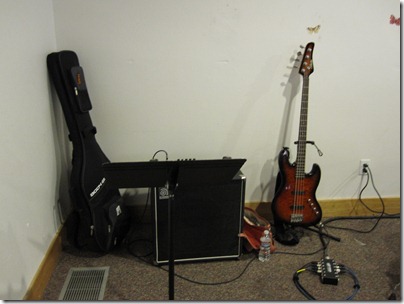
The setup.  I got to hide in the back corner and sit on my amp.  I find that being directly in front of (or sitting on) my amp, and right next to the drums, is all the monitoring I need.

IMG_0507

My little corner.

DSCF1206

The team in action, and I‘m just hanging out in my little corner.

Monday, May 16, 2011

4:3 Screens Faceoff–iPad vs x61t

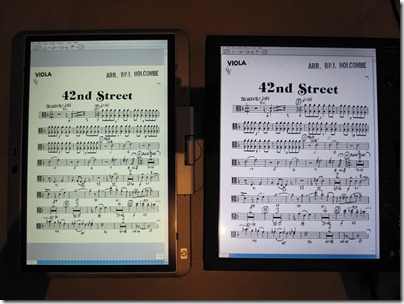
By special request, a photo comparison of sheet music reading on a 9.7” iPad vs the 12” Lenovo x61t.

IMG_0562

In case you weren’t sure, that’s the iPad on the left and the x61t on the right.  For notes-on-the-staff music reading, the iPad is just not big enough. 

I have used the iPad recently for some playing I did recently on bass.  I just have to read lead sheets for that (chords over lyrics, even though our lead singer/guitarist likes to call it sheet music), so the smaller screen size is less of an issue.  There will be more on that experience in another post. 

Saturday, May 14, 2011

The Tweeting Baseball Organist

image

This is perhaps one of the more interesting mixes of technology and music I’ve seen – tweet your requests to Atlanta’s Turner Field organist. 

From the Wired article:

“But perhaps the best reason to follow Kaminski is right there in his Twitter handle, @bravesorganist. When he’s not playing jazz, polka or salsa, Kaminski plays the organ at Atlanta’s Turner Field during Braves home games — and he’s taking requests through Twitter.

This is now his third season with the Braves, and by crowdsourcing roughly half of his in-game playlist, Kaminski has allowed his followers to hear their quirkiest suggestions for visiting teams’ at-bat music played live for the tomahawk-chopping multitudes. (It’s certainly cooler than requesting John Fogerty’s “Centerfield” on your local classic rock station.)”

Read the full story at Wired.

Friday, May 13, 2011

enTourage Pocket eDGe finally arrives

I love woot, but my goodness their shipping takes for-e-ver.

IMG_0555

I had the chance to play with these at CES, and really liked the Pocket eDGe (although I’m not a fan of their capitalization).  I just didn’t think I needed another gadget, and not for the prices they were going for.  When the Pocket eDGe showed up on woot for $150, I thought, why not?  Now I’m wondering why I didn’t do it sooner.

The Pocket eDGe is a “dual book” with a 7” Android tablet on one side, and a 6” eInk screen on the other.  The best part of the eInk side is that it’s Wacom Penabled.  The stylus that comes with it is pretty thin, but since it’s Wacom Penabled I am able to use any stylus from any of my other tablets.  In a nice stroke of good timing – my x61t came with an extra stylus, which will now live with the eDGe. 

I’ve gotten the upgrade to 2.2 done, and I’m trying to hunt down my usual Android apps with no market access.  Luckily, the easy to install Amazon App store has most of what I want.  The enTourage store is a little thin. 

My first impressions of the device are how small and light it is.  I think this is a great size for a portable notetaking device.  The resistive touch screen is more responsive than I had feared, and actually quite easy to use.  The eInk side is a little slow to follow the pen, but quite usable.  It’s much less laggy than the Penabled Sony Readers I tried at CES. 

Enjoy the unboxing while I play….

Sunday, May 8, 2011

A Lenovo x61t Thinkpad takes over

X61_Tablet

I had seen one with the SXGA+ screen on ebay a few months ago and nothing since.  The SXGA+ (1400x1050) screen is apparently hard to come by.  But the older 4:3 12” screens offer a better size for music reading.  I wasn’t willing to deal with XGA (1024x768) as that’s what the TC1100 runs, as well as the Motion LE1600 I got to test, and that’s just not enough pixels for me.  The Motion LE1700 gives you an SXGA+ screen is a sleek slate form factor, but even with the extended slice battery would not give me the battery life I was looking for (the HP 2730p with a new slice battery has spoiled me). 

Then, an SXGA+ x61t showed up on craigslist.  It’s still a Core 2 Duo machine, although one graphics chipset behind my HP 2730p.  It’s still 4GB of RAM, and I get a much bigger 320GB HDD with way more expansion options as it’s a standard 2.5” hard drive.  The older chipset makes it hackintosh friendly too, which is a project for the future. 

IMG_0549

The screen is just amazing.  I’m a pixel junky and usually like to see as many pixels crammed into screens as possible.  The only machine I’ve used that was pushing too many, forcing me to turn up the DPI, was Sony P – 1600x768 crammed into 8”.  One of the main reasons I’ve been tempted by the new 13” macbook air is the higher res screen.  It’s about time we started seeing options over 1280x800. 

I’ve already used it for a concert this afternoon, and I’m looking forward to taking it to the studio tomorrow.  The only drawback is that the battery life, while comfortable for a concert, may not be enough for a full teaching day.  Good thing the craigslist deal came a spare extended battery.  I’ll just have to swap between lessons. 

Tuesday, April 26, 2011

Tablets in the Classroom Part 5–Fujitsu’s T580


Note: this is the fifth in a series of articles I will be writing for TabletPCBuzz.com, reposted here with permission.


The Fujitsu T580 presents an intriguing option for the classroom. It is similar in size and weight to the Intel Classmate convertibles with a chucky, rugged feeling design. It’s also more powerful and packs a dual pen and touch digitizer. Sadly, it also packs a few rather annoying flaws.
Let’s take a look at the good stuff first.

Size and Weight

The T580 is built like a chunky netbook. That’s likely good news for kids who are already used to carrying machines of that size. It feels comfortable to carry around and I even feel okay holding it in one hand, unlike the 12” convertibles that need to be held in the crook of the arm.

Power

The size may say netbook, but this machine is packing a Core i5 processor, and can support up to 4GB of RAM, even though the demo unit only has 2GB.

Ruggedness

While not designed to mil spec ruggedness, the T580 has a spill proof keyboard, a shock sensor for the hard drive, and offers several SSD options as well.

Dual Pen and Touch

A good capacitive touch experience is essential for a generation of kids who have grown up being handed their parent’s iPhone as a pacifier. It’s also the reason touch interfaces can be intuitive – when you touch it, something happens. Nothing is more frustrating than touching, then tapping, then tapping harder to try to get things to happen. And the T580 delivers.
While the n-trig pen experience is not quite as smooth and easy as Wacom, it’s still a step up from writing on a resistive screen and about a million times better than trying to mess with a capacitive stylus on a Windows tablet.

Using OneNote with a dual pen and touch screen Is a dream. The pen inks, while fingers call up the panning hand to move the page around, which makes the experience very much like working with paper.

Now for the bad.

N-trig pen

As awesome as working with a dual pen and touch screen is, it’s not all rainbows and unicorns with n-trig. All the negative things you’ve heard about the n-trig digital pencil apply here too. It takes the machine a second or two to recognize that the pen has come into range, and sometimes doesn’t switch until you’ve actually put the pen to the screen to try to write, leading to unintended things being activated by your hand. There is also a similar lag going back to finger touch.

Also, the pen is heavy. It may be the same size as the pen for my HP 2730p, but it weighs more than the super chucky TC1100 stylus. It also takes more pressure than I would like to push the tip in to activate the ink flow. Those things combine to make for a tiring writing experience. I don’t think I could write like that all day in school.

Noise

The pen tip is pretty noisy as it gets pushed in. It’s kind of like a clacky mouse button. A classroom full of clacky pens is only minimally better than a room full of students pounding away on keyboards. Also, the fan in this thing runs All The Time. It’s not particularly loud, but it is pretty constant. I guess that’s the price you pay for a core i5 processor, but a classroom full of them could get loud.

Battery

I’m getting just under 2 hours with wifi on and brightness just two clicks up on power saver with the 3 cell battery. Yeah, under 2 hours. I don’t know why they even bothered with a 3 cell option. But even with the 6 cell being twice the capacity of the 3, that’s only around 4 hours. I’m also finding that it takes forever to recharge the battery. After the machine slipped into hibernation (after less than 2 hours), I left it hibernating and plugged it in. It took 4 hours for the charge light to turn green. Trying to charge the battery while the machine is running doesn’t seem to really go anywhere.

Keyboard

For me, it feels small, and I’ve been through a lot of netbooks. I’m currently back to typing on mostly full sized keyboards though, and I find I make more mistakes on the T580. Especially annoying is the smaller period key, which I miss frequently. My hands also get tired faster on this keyboard. For kids with smaller hands, this may not be an issue though. It is comparable to other 10” netbook keyboards.

Thickness for Desk Writing

While the chunkiness of the machine doesn’t bother me for general use, it is a bit annoying when trying to use the machine in tablet mode on a desk.

Conclusion

The Fujitsu T580 is a powerful machine in a little package. The touch experience is great, and the active pen works well enough once you get used to it. But the battery life is disappointing and would be a deal breaker for a student who needed it to run through a full day of school. It’s also pricey for a school trying to outfit a classroom or for a parent sending it off to school with a kid. Despite the drawbacks, the size and weight are very nice, and this little powerhouse is growing on me. I could see it working well in the classroom if only the batter life were better.